Opposites attract in exhibit design. All sorts of juxtapositions, like big/small and old/new create interest for museum visitors.
I was reminded of this in every unusual way during a trip to the city of Plovdiv, in Bulgaria.
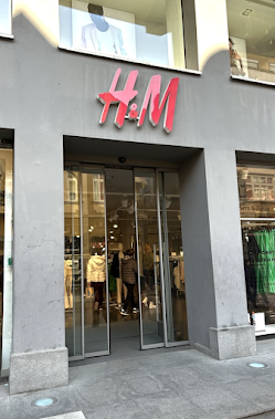
My friends wanted to take me inside a local H&M clothing store to show me a "secret."
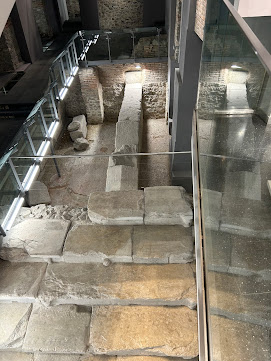
Inside was a glass-enclosed remnant of a Roman-era stadium (including some stone seats!) where spectators had watched the chariots race by thousands of years ago!
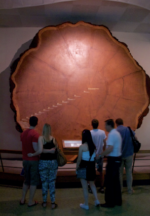
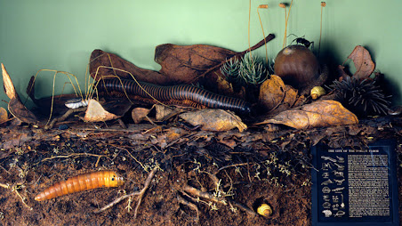
Other examples of "opposites" can be found in the Hall of North American Forests at the American Museum of Natural History in New York City.
The giant Sequoia cross-section pictured at the top of this post, or the amazing "Life on the Forest Floor" diorama, with its cross-section of forest soil (enlarged to 24 times its actual size) are examples of a big/small contrast.
When you start looking for these design "opposites" they start to show up everywhere. How can you add an "attractive opposite" to your next project?
Paul Orselli writes the posts on ExhibiTricks. Paul likes to combine interesting people, ideas, and materials to make exhibits (and entire museums!) with his company POW! (Paul Orselli Workshop, Inc.) Let's work on a project together!
If you enjoy the blog, you can help keep it free to read and free from ads by supporting ExhibiTricks through our PayPal "Tip Jar"


