"Tricks of the Trade" about Exhibits (and Museums.)
Useful information and resources for museum exhibition design and exhibit development.
Friday, June 21, 2013
Technology's Kaleidoscope --- Reflecting on the HCI+ISE Conference
"You should always think about what you really want to accomplish first, before you start thinking about the technology you want to use." This became a common refrain at the HCI+ISE (Human Computer Interaction in Informal Science Education) Conference that happened just last week in Albuquerque.
The why before the how, if you will.
However, "technology" is a slippery term, as is the implementation of technology in informal learning environments. And everyone who uses (or creates) technology, especially digital technology, tends to view its uses through a very personal lens --- like a kaleidoscope that shifts and changes depending on who is using it. I still see so much cringe-worthy digital technology deployed in exhibitions that I wonder if the WHY really does happen before the HOW in the most museums.
But rather than concentrate on the bad examples of tech implementation, I wanted to share some things that resonated with me in a positive way from the HCI+ISE Conference. I'm honestly still mentally unpacking lots of meaty conversations and ideas to try to make better sense of it all. But here, in no particular order, are projects, people, and ideas that stuck out for me:
Accessibility, and accessible technology, was a big part of the HCI+ISE conference. Folks who are doing really interesting work in this regard include the Boston Museum of Science's "Creating Museum Media for Everyone" team. Some interesting things that came out of these discussions included ideas about "sonification" --- the idea of supplementing, or augmenting, traditional visual approaches with additional sonic cues and layers. (Check out the work of the Georgia Tech Sonification Lab.)
One of the Conference's participants and presenters was Sina Bahram. He spoke about looking for ways to create standards for accessibility interfaces and the notion of creating graphic overlays where each layer could relate to different learning abilities and modalities. (Imagine a sonic layer over a traditional iPad interface for people with visual impairments, for example.) You should definitely check out Sina's website for more ideas in this regard.
We spent a bit of time at the Conference articulating differences between "digital" and "physical" exhibits and environments, including the social aspects of those differences. I liked the discussions about:
• The differences between wall-based and table-based multitouch units and how visitors use them
• How do the types of devices used shape visitor expectations. (Does every touchscreen now have to act like an iPad --- to be able to pinch or expand screens, or to sweep through images?)
• Does NUI (Natural User Interface) only "work" if the objects don't "misbehave"?
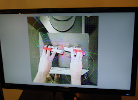
Geeky, but good, stuff! Which naturally led the Conference conversations and presentations into interlocking conversations about AR (Augmented Reality.) There's a lot to say about this topic, but one of the HCI+ISE projects using AR that I really like is the NSF-funded ARIEL (Augmented Reality for Interpretive and Experiential Learning) Project out of the Franklin Institute in Philadephia. One of the goals of ARIEL is to make "invisible" forces more visible (like the magnetic field exhibit pictured below.)
Also, I liked one of the ARIEL team member's quotes that exemplified their team's willingness to take risks: "Everytime something worked, it was a happy accident."
Check out the ARIEL website --- there are lots of good resources there.
Seb Chan highlighted the cool things happening at the Science Gallery in Dublin, an edgy, program-heavy place programmed with temporary exhibits on current science that only allows visitors over the age of 16 to visit their space. (They had me at Blood Wars, a program where blood is drawn from different visitors to have their white blood cells fight in a "death match" !)
Erika Kiessner was feeling a bit conflicted about "usability" but articulated three key aspects of good usability for visitors in exhibits, either with or without digital technology.
Good Usability:
• Is comfortable (physically appropriate)
• Does not make people feel dumb
• Puts people in control (with no obvious limits)
Dave Patten from the Science Museum of London, spoke about the many possible uses of digital technology in a large, object-based museum (and showed some cool experiments involving projection-based media) but I couldn't help but fall in love with a deliberately low-tech artist intervention called the Cockroach Tour!
Some other things that are still bubbling up in my mind from the HCI+ISE Conference include:
• The role of digital technology in "Citizen Science" projects.
( iNaturalist.org is a good website to check out in this regard.)
• Funky Forest --- an interactive/tech ecosystem where children create trees with their bodies and then divert the water flowing from the waterfall to the trees to keep them alive. The health of the trees contributes to the overall health of the forest and the types of creatures that inhabit it. Check out the video!
• The book Consumer.ology about the "myth" of Market Research sounds fab!
I guess the mark of a great conference (and interesting conference participants!) is that I'm still thinking and sorting ideas that I encountered in Albuquerque. I may revisit some of them here on ExhibiTricks in the future, but for now I'll leave you with a quote from one of those interesting participants, Beck Tench:
"At home I want to use tech to make time, not waste it."
Don't miss out on any ExhibiTricks posts! It's easy to get updates via email or your favorite news reader. Just click the "Sign up for Free ExhibiTricks Blog Updates" link on the upper right side of the blog.
P.S. If you receive ExhibiTricks via email (or Facebook or LinkedIn) you will need to click HERE to go to the main ExhibiTricks page to make comments or view multimedia features (like videos!)

