Margaret Middleton was kind enough to share some thoughts with ExhibiTricks readers about their latest project in this Guest Post below.
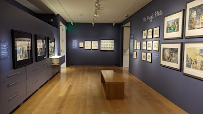
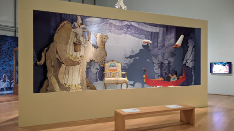
I just finished working on a new temporary exhibit at the Isabella Stewart Gardner Museum, Drawing the Curtain: Maurice Sendak’s Designs for Ballet & Opera. The exhibition team wanted to make sure the exhibit was welcoming for families with children since most visitors would know Sendak as the author and illustrator of Where the Wild Things Are. As the exhibit designer on the project, I brought my experience in children’s museums, and together we created something new for the Museum. Here’s a little summary of what we did to make this exhibit work for visitors of all ages.
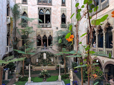
In order to appreciate the departure that Drawing the Curtain represents for the Museum, you may need some context: the Isabella Stewart Gardner Museum, founded in Boston in 1903, is set in a Venetian-style palazzo with grand rooms packed with art and a wondrous garden in the center courtyard and in 1990 it was the site of the biggest art heist in modern history. In addition to being known for beauty and scandal, the Gardner is also known for being traditional. I remember visiting as a child and finding it magical -- if a little forbidding. Galleries silent, no photos allowed. I remember being afraid of the guards after one scolded me. That cold climate began changing when they built a new wing with a performance space and a temporary exhibit gallery. It’s a much friendlier visit than the one I remember as a child. Having seen this transformation firsthand, I am particularly excited to have helped create the Museum’s first exhibit that explicitly welcomes families with children.
Here are three qualities that make this exhibit unique:
1. Lower hang-height
The exhibition is hung at 48” on center instead of the typical 60”, providing better visual access for older children and other people under 5’ tall. This also is a more comfortable viewing height for wheelchair users. We also included a few step stools in the gallery in case anyone needed an extra boost.
2. Family labels and large type
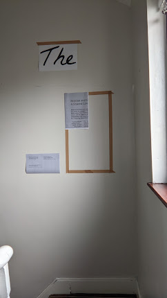
Family labels offer prompts with questions to help adults and children engage with the artwork together. I used larger type for exhibit labels to make them easier to read. Large type also means that most visitors don’t have to be very close to the label to read it so they can glance at the artwork while they read, or they can read together with another visitor. Most label copy in the exhibit is 48 or 30 point and the smallest type is 16 point. To get a feel for the sizes and heights, I like to print labels out on my printer and tape them up on a wall at home.
3. Things to do
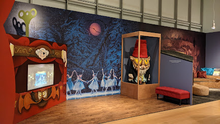
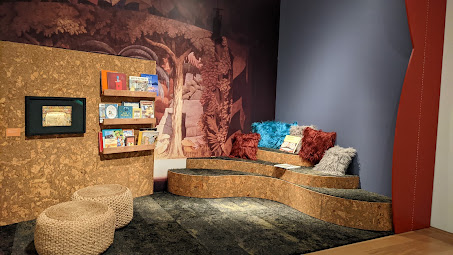
Along the back wall of the exhibit is a dedicated area especially for children. There is a stage where children can dance next to a real costume from the Nutcracker and a reading area with cozy seating where families can curl up with a favorite Sendak title. These are themed environments but they are not superficial: these spaces have real exhibition artwork in them like the rest of the gallery and engage with the exhibit content in relevant, age-appropriate ways. By integrating this space in the gallery instead of as a separate room, the exhibit communicates a sense of welcome for both children and adults.
The exhibition is currently on view at the Isabella Stewart Gardner Museum and runs until September 11, 2022. Please go and check it out and let me know what you think.
Special thanks to 42 Design/Fab Studio for their excellent fabrication work on this project.
For more reading on creating inclusive museum environments for children, check out Margaret’s chapter in Welcoming Young Children Into the Museum.
Paul Orselli writes the posts on ExhibiTricks. Paul likes to combine interesting people, ideas, and materials to make exhibits (and entire museums!) with his company POW! (Paul Orselli Workshop, Inc.) Let's work on a project together!
If you enjoy the blog, you can help keep it free to read and free from ads by supporting ExhibiTricks through our PayPal "Tip Jar"


No comments:
Post a Comment