Wednesday, June 29, 2022

Drawing the Curtain: Making a Child-Friendly Exhibit in an Art Museum


Margaret Middleton was kind enough to share some thoughts with ExhibiTricks readers about their latest project in this Guest Post below.

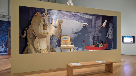
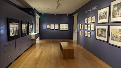
I just finished working on a new temporary exhibit at the Isabella Stewart Gardner Museum, Drawing the Curtain: Maurice Sendak’s Designs for Ballet & Opera. The exhibition team wanted to make sure the exhibit was welcoming for families with children since most visitors would know Sendak as the author and illustrator of Where the Wild Things Are. As the exhibit designer on the project, I brought my experience in children’s museums, and together we created something new for the Museum. Here’s a little summary of what we did to make this exhibit work for visitors of all ages.

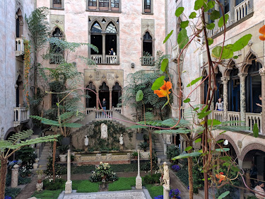
In order to appreciate the departure that Drawing the Curtain represents for the Museum, you may need some context: the Isabella Stewart Gardner Museum, founded in Boston in 1903, is set in a Venetian-style palazzo with grand rooms packed with art and a wondrous garden in the center courtyard and in 1990 it was the site of the biggest art heist in modern history. In addition to being known for beauty and scandal, the Gardner is also known for being traditional. I remember visiting as a child and finding it magical -- if a little forbidding. Galleries silent, no photos allowed. I remember being afraid of the guards after one scolded me. That cold climate began changing when they built a new wing with a performance space and a temporary exhibit gallery. It’s a much friendlier visit than the one I remember as a child. Having seen this transformation firsthand, I am particularly excited to have helped create the Museum’s first exhibit that explicitly welcomes families with children.


Here are three qualities that make this exhibit unique:

1. Lower hang-height 


The exhibition is hung at 48” on center instead of the typical 60”, providing better visual access for older children and other people under 5’ tall. This also is a more comfortable viewing height for wheelchair users. We also included a few step stools in the gallery in case anyone needed an extra boost.


2.  Family labels and large type 


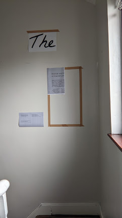
Family labels offer prompts with questions to help adults and children engage with the artwork together. I used larger type for exhibit labels to make them easier to read. Large type also means that most visitors don’t have to be very close to the label to read it so they can glance at the artwork while they read, or they can read together with another visitor. Most label copy in the exhibit is 48 or 30 point and the smallest type is 16 point. To get a feel for the sizes and heights, I like to print labels out on my printer and tape them up on a wall at home.


3. Things to do 


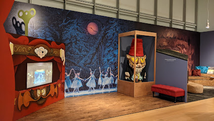
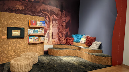
Along the back wall of the exhibit is a dedicated area especially for children. There is a stage where children can dance next to a real costume from the Nutcracker and a reading area with cozy seating where families can curl up with a favorite Sendak title. These are themed environments but they are not superficial: these spaces have real exhibition artwork in them like the rest of the gallery and engage with the exhibit content in relevant, age-appropriate ways. By integrating this space in the gallery instead of as a separate room, the exhibit communicates a sense of welcome for both children and adults.


The exhibition is currently on view at the Isabella Stewart Gardner Museum and runs until September 11, 2022. Please go and check it out and let me know what you think. 

Special thanks to 42 Design/Fab Studio for their excellent fabrication work on this project.


For more reading on creating inclusive museum environments for children, check out Margaret’s chapter in Welcoming Young Children Into the Museum


Don't miss out on any ExhibiTricks posts! It's easy to get updates via email or your favorite news reader. Just click the "Sign up for Free ExhibiTricks Blog Updates" link on the upper right side of the blog.

Paul Orselli writes the posts on ExhibiTricks. Paul likes to combine interesting people, ideas, and materials to make exhibits (and entire museums!) with his company POW! (Paul Orselli Workshop, Inc.) Let's work on a project together!

If you enjoy the blog, you can help keep it free to read and free from ads by supporting ExhibiTricks through our PayPal "Tip Jar"

Tuesday, June 21, 2022

Exhibit Aphorisms Too (and a GIVEAWAY!)


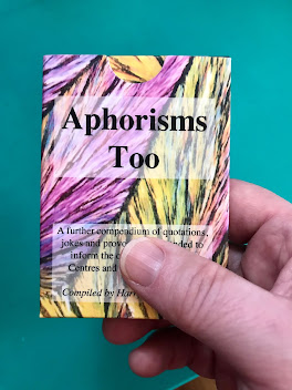
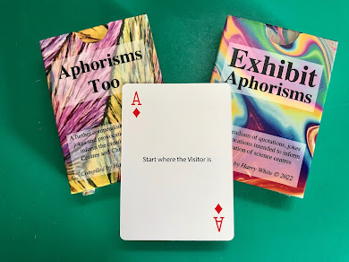
Harry White has recently introduced his second card deck of exhibit aphorisms and was kind enough to share some thoughts about "Aphorisms Too" with ExhibiTricks readers.


What are exhibit aphorisms and what are they for?
In 1996 Techniquest started the UK’s first Master’s course in Science Communication based in a Science Centre.  It was a great success with students from all around the world, and graduates were quickly snapped up by science centres.  I taught the Exhibit Development module but, after a year of PowerPointing the students into submission, I felt that it just wasn’t appropriate to teach a degree about informal education, formally.  

“Power corrupts, PowerPoint corrupts absolutely”

Also, whenever I ran out of material for a session, just saying something deliberately controversial would start a debate that would fill the time and engage the students.  So, I started collecting these quotations, jokes, and provocations as aphorisms and put 52 of the best/most annoying onto a deck of cards.  When the sessions flagged, I’d ask someone to pick a card, read it out and then the group would try and fathom what I was getting at.  Most times a heated debate would ensue and my session would go like a charm.

More recently I have used them in consulting with developing science centres around the world. In this circumstance, I started adding quotations from other people in the industry and this has extended the repertoire considerably. But as many of these are well known I have kept them to a minimum of essential ones in the card deck. 

The idea of an Aphorism is to put some core truth in a memorably flippant way so that people who are “in the know” recognise it and those who don’t, think about it.  As an instructional tool, this has a fatal flaw in that anyone who “gets” it doesn’t need it, and those that need it, don’t get it. 

But aphorisms are memorable and anti-intuitive, a bit like a good exhibit.

Also, an omitted Aphorism is that:

 “As soon as you print a pack of Aphorism Cards, lots of new, better, more meaningful Aphorisms will be found”


After printing 3 batches of the original Aphorisms card deck, I realised that with 900 packs in circulation, someone must be taking it seriously, or there are a vast number of wobbly desks needing something under one leg out there. So, I felt that I should make some minor corrections for this batch. For instance, originally the Joker Aphorism was: 

“A Consultant is a man who borrows your watch and then charges to tell you the time” 

and I was that man! But in reality, there are plenty of consultants of both genders and so now I am an equal opportunities insulter. 

The first pack of Aphorisms drew from a long list, built up over many years, and naturally I included the ones that I thought were best. In the time since the first "Exhibit Aphorisms" deck was published, I collected even more aphorisms. I did consider combining the first set with the newly collected ones but then which would I leave out? And so, I embarked on the second card set, "Aphorisms Too."

And so, this second batch of “quotations, jokes, and provocations” is perhaps a little less flippant, but it does still try and look at Science Centre life with humour. It is less focused on exhibits than the previous set, reflecting my developing practice in the creation of Science Centres and Children’s Museums over the intervening years.


Here are a few examples from the Aphorisms Too deck with commentary:


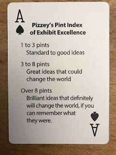
Ace of Spades
Pizzey’s Pint Index of Exhibit Excellence 

1 to 3 pints
Standard to good ideas 

3 to 8 pints
Great ideas that could change the world 

Over 8 pints 
Brilliant ideas that definitely will change the world, if you can remember what they were. 

I remember meeting Steve in a pub near the Science Museum in London and after a very productive exhibit brainstorm we came up with this aphorism and I wrote it in my notebook. Many years later when I was putting this second batch of Aphorisms together, I asked Steve if he minded if I used this and attributed it to him. He didn’t remember the Aphorism at all, which by applying “Pizzey’s Pint Index of Exhibit Excellence” recursively means it must be a really great Aphorism.

There is another, less relevant, anecdote about this “exhibit ideas” session. Steve and I had both been to a pitching session for a new gallery at the Science Museum and as we were leaving Steve wanted to show me his latest toy, a GPS device, which in these pre-smartphone days was pretty cutting-edge stuff. “Look and type in "Pubs Nearby" and immediately it shows me the nearest. So, we set off for the “Hoop and Toy” following the directions from Steve’s device. I expressed my admiration for the technology and Steve said, ”But you haven’t heard the best bit yet! In order to get all the pubs programmed into the device, you have to visit each one and register its location.” You have to go on a pub crawl to enable future pub crawls!


Ace of Hearts
“Playing with clay makes no pots, playing with clay makes potters”

This was the Aphorism that meant I had to make a second pack. It is so good and sums up what we do, it answers all the “But are they learning anything?” complaints perfectly.


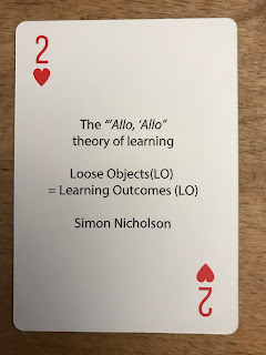
2 Hearts
The “Allo, Allo” theory of learning

Loose Objects (LO) = Learning Outcomes (LO)

Simon Nicholson


“Allo, Allo” is an old British comedy programme, it caricatures British attitudes to the Second World War and is a pastiche which includes some pretty dated ideas of comedy, that would not be “PC” nowadays, but it is fondly remembered.

The more loose objects there are in an educational toy, the more degrees of freedom, and the more potential there is for learning. When I was a boy, Lego bricks came in red or white and had 2, 4, or 8 spots; I could build anything my imagination could conceive, and I did, planes, rockets, houses, submarines for mice (best forgotten!). With modern sets the parts are so specific you can only build the DeathStar.

In 1971, Simon Nicholson wrote an article in a Landscape Architecture journal called "How NOT to Cheat Children – The Theory of Loose Parts"


A pile of sand is almost the ultimate experiential learning experience, no wonder kids like the beach.

There is a quote from William Gibson’s book, All Tomorrow’s Parties:

“That which is overdesigned, too highly specific, anticipates outcome; the anticipation of outcome guarantees, if not failure, the absence of grace.”


Ace of Clubs
Safety Engineering

One bad accident could close your centre forever.

If you have 100 exhibits with 100,000 Visitors per annum, there are 10 million visitor/exhibit interactions per year

 So, a “one in a million chance” gives almost an accident every month


When working with the staff of Science or Engineering based companies, or universities, often the creation of exhibits based on their technologies is viewed by that staff as “making toys”. 
One prototype of a jointly-developed exhibit had a giant “Train Points”-style lever with a sprung return which, when released, hammered into the heavy brass surround, it was a thing of beauty and a deadly finger guillotine. 

The co-developers tended to dismiss my concerns, ”No one would be silly enough to put their finger in there” etc. I needed a way to show the risk in a way that fitted with their mindset of engineering precision. And so, this Aphorism was born giving risk as a Parts per million. This approach and the sacrifice of a child’s finger-sized carrot thankfully ended the discussion.


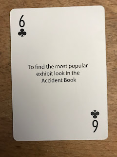
6 Clubs
To find the most popular exhibit look in the Accident Book

A Science Centre is a safe place for Visitors, but the allure of apparent danger is there in many of the most popular exhibits, The Gyro Chair, The Mirror Maze etc. So, as well as being amongst the most used, these exhibits also figure prominently in the institution’s Accident Book. The decision to keep or retire an exhibit on the grounds of safety is one of the trickiest an exhibition manager has to make.


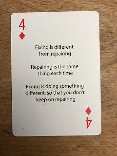
4 Diamonds
Fixing is different from repairing

Repairing is the same thing each time

Fixing is doing something different,
so that you don't keep on repairing

In a Science Centre that develops its own exhibits, the exhibits become a process, evolving to convey the content better to the Visitor and to become easier to maintain. Although we must be careful that making the exhibit easier to maintain doesn’t harm the learning experience. In one Science Museum I worked with the Maintenance Team would gladly have put every interactive in a glass case with a push-button, just to reduce their workload, 

Often in SC’s where the exhibits are bought-in, it is harder to change the exhibit to work better without voiding some nebulous warranty and so the Visitor experience cannot be improved.


Queen of Diamonds
Fundraising moves money,
it doesn't make money

If you make money from your own activities, if your organisation is profitable, then you decide what you do with that profit. If you rely on funders then they set your goals, and these may not be compatible with your own or with your long-term viability.

So, look every gift horse square in the mouth before accepting their money. Costs are made up of Capital costs, revenue costs, and legacy costs to the organisation.


Thanks are due to the many practitioners whose words I have mangled for my own use, wherever I can I have given credit to them. I also should thank the many institutions around the world that have gainfully employed me and whose experiences, painful and otherwise, I have tried to distill into short, glib, aphorisms.

Thanks are also due to Paul Orselli of POW! and Sherry Marshall of Science Museum Oklahoma, who encouraged me to get this set done, and to Thorsten Kunnemann of Technorama, the Swiss Science Centre who has employed me and given a platform to these aphorisms in the Exploratory Encounters workshops for those developing their own Science Centres and to my wife, Jen, who has had to endure endless versions of these over many, many years.

I hope that you enjoy them and that they help you to develop your plans, but please don’t take them too seriously.

Any corrections or suggestions can be sent to me at harry.white90@ntlworld.com 


AND NOW THE GIVEAWAY!

We'll be giving away 4 prizes to four lucky winners  -- 2 sets of both the first and second Exhibit Aphorisms decks, and 2 individual decks of the winner's choice (either the first or second deck.)

There are two ways to enter the giveaway:

1) Become a subscriber to ExhibiTricks by clicking the link at the top right of the blog's homepage, where it says, "Sign up NOW for Free ExhibiTricks Blog Updates."

2) If you are already a subscriber, then send an email to: info@orselli.net with the subject line, "Aphorisms Deck Giveaway."

Enter by July 5, 2022 to be eligible to win one of the four prizes.  GOOD LUCK!


Don't miss out on any ExhibiTricks posts! It's easy to get updates via email or your favorite news reader. Just click the "Sign up for Free ExhibiTricks Blog Updates" link on the upper right side of the blog.

Paul Orselli writes the posts on ExhibiTricks. Paul likes to combine interesting people, ideas, and materials to make exhibits (and entire museums!) with his company POW! (Paul Orselli Workshop, Inc.) Let's work on a project together!

If you enjoy the blog, you can help keep it free to read and free from ads by supporting ExhibiTricks through our PayPal "Tip Jar"

Tuesday, June 14, 2022

Marking a Cheapbooks Milestone


Today I thought it was important to mark a meaningful personal/professional milestone -- The Exhibit Cheapbooks became available for FREE one year ago, and the very first volume of Cheapbook exhibit ideas got turned loose nearly 27 years ago!

That's right -- nearly 100 free exhibit "recipes" contributed by museum colleagues from all over the world are available to download as PDFs from the POW! website.  (Did I mention that they're FREE?)

A little history --the idea for the Exhibit Cheapbooks started during sessions at the annual Association of Science-Technology Centers (ASTC) Conference with the purpose of sharing "cheap" exhibit ideas and creating a written record of how to replicate these simple and successful exhibit components.

The very first "Cheapbook" was compiled and published by ASTC in 1995. Subsequent volumes appeared in 1999, 2004, and 2014.

The Exhibit Cheapbooks have always celebrated the "sharing" nature of museums. You will find varied exhibit ideas from museum colleagues from around the world inside each volume. 

Sincere thanks to everyone who has shared their ideas and expertise by contributing ideas over the years! And special thanks to ASTC for allowing all the Exhibit Cheapbooks material to now be shared freely online.

Think of all these Exhibit Cheapbooks entries not as detailed shop drawings, but rather as creative jumping-off points for your own exhibit building.

So what are you waiting for?  Click on over to the Exhibits Cheapbooks Download Page and start making cheap exhibits!

Have fun!


Don't miss out on any ExhibiTricks posts! It's easy to get updates via email or your favorite news reader. Just click the "Sign up for Free ExhibiTricks Blog Updates" link on the upper right side of the blog.

Paul Orselli writes the posts on ExhibiTricks. Paul likes to combine interesting people, ideas, and materials to make exhibits (and entire museums!) with his company POW! (Paul Orselli Workshop, Inc.) Let's work on a project together!

If you enjoy the blog, you can help keep it free to read and free from ads by supporting ExhibiTricks through our PayPal "Tip Jar"

Tuesday, June 7, 2022

Creating Wobbly World -- An Interview with Liza Rawson and Cas Holman


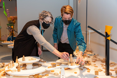
Recently Liza Rawson, Head of Exhibition Development + Design at the Liberty Science Center (LSC), and Cas Holman, founder and principal designer at Heroes Will Rise, were kind enough to share some thoughts about the Wobbly World exhibition for early learners (aged birth to 5) at LSC that they worked on together as part of a complex collaboration with many other creative partners.  (In the photo at the top of this post, Liza is on the left and Cas is on the right.)


What prompted your collaboration on Wobbly World?

Liza: We had been playing around with the concept of balance for a young learner gallery for a while. The idea had a lot of the qualities that we look for at LSC. It’s rooted in science, connects to art, lends itself to interactivity and iconic features, and, importantly, inspires and draws inspiration from early learners, who experiment with balance from their very first movements. Balance is something that adults will understand and kids will do. In a nutshell, balance is an invitation to activity. 

Our goal was to turn this concept into an iconic, child-led, no-fault play zone that supported kids’ open-ended exploration, experimentation, performance, and imagination. A place that meets kids where they are in their development at a particular moment, but allows for and accommodates their growth and expanding abilities. And a space that was beautiful, delightful, joyful, and accessible for children and their adults, and completely unique to LSC.

Totally out of the blue, a former colleague reached out and told me I had to watch the Netflix series Abstract: The Art of Design, specifically the episode featuring Cas -- Cas Holman: Design for Play.

I knew Cas’s designs—the big blue Imagination Playground blocks and the building system Rigamajig—but the episode really dug deep into her design process and philosophy and I was hooked.  I watched it twice in a row—the second time I took notes! 

Cas’ way of designing toys and manipulatives that inspire intuitive, imaginative, open-ended, collaborative play across a broad range of ages and skill levels really resonated with our own approach. Cas’ belief in children’s agency to direct and shape their play and, by extension, their world, seemed like a natural fit for Wobbly World.

I wrote to the general “contact us” link on the Rigamajig website asking if Cas would be open to coming to play with us to re-conceive our existing young learner gallery and to our delight she accepted.


Cas: The first few meetings with a new collaborator or client feel a lot like a date. Are we compatible? Do we understand each other? Do we inspire each other to imagine something exciting?  In our initial video call, Liza explained the broad strokes of what they were interested in. It aligned with what I’m interested in designing, so we met again.  

The second meeting was with Paul [Hoffman, LSC’s CEO] for a tour of the space, and that’s when it became really clear that we could create something really special. We spent a morning together walking around LSC and in their descriptions of the exhibits I heard: trust of children, respect for open-ended activities, and a desire to have truly unique spaces that put play at the center of the learning. Clearly, we were meant to collaborate. 


Why is the exhibition called Wobbly World?

Liza: Nearly every movement of early learners exemplifies the concept of balance—of being unbalanced, off-balance, and rebalancing. From the time babies first try to balance their big heads and sit up (and fall over), to their first steps and beyond, children are testing and strengthening their balance skills with their bodies and with things. As they grow, kids naturally experiment with balancing blocks, food on a spoon, and other objects. 

In addition, we were conscious that this generation of children in particular has had a formative relationship with the unknown, the unpredictable, and the imperfect. We wanted to create a space that through play, allowed more comfort with the precarious balance we live in. We wanted a play space where process, exploration, and curiosity are valued over known outcomes and mastery.

When it came time to choose a title, we brainstormed a whole list of words that might express the activity of both balance and unbalance. Wobble World was the top pick. But when Cas was prototyping with kids, they kept calling it Wobbly World because they thought it was more fun to say. And they were right!


Cas: The entire design, prototyping, fabrication, and installation process happened in the midst of the pandemic. Along with all the reasons Liza listed relating to a toddler’s experience embodying balance, we, the adults, were experiencing new challenges to balance in our lives. I love that we created a space where we can see, manipulate, and play with our Wobbly World. Notice the goal is not to control or fix it. The activities are wobbly and stay that way. 


What are the most surprising or unexpected visitor behaviors in the space?

Liza: The Body Mobile is the central feature of the gallery.  It’s an interactive, full-body, collaborative experience, inspired by the stabiles of Alexander Calder, where kids work together to move elements that spin, rotate, teeter, and wobble. 

When we first opened in late fall 2021, we noticed that children were hesitant to play together, preferring to be alone or with a caregiver. We wondered if it was because they had few opportunities to be together in a shared and collaborative play environment due to the pandemic. Thankfully this seems to be less of an issue in recent months.

Another unexpected behavior is how kids play with the Balance Blocks. The blocks are surprising shapes that allow kids to build off-kilter structures that balance (or not). The blocks slide into a puzzle wall for storage. We were surprised by the number of children who are more interested in the puzzle wall and cleaning up than building. 


Cas: I’m curious to continue learning about how children are using the Balance Blocks. We playtested them early and found that kids loved them, but they are a very new idea and there is a lot to learn there. We designed them to facilitate trial and error, pattern matching, and process over outcome. The forms do not lend themselves to building any particular defined thing, but rather a somewhat zen stacking and restacking of the pieces. I call them “precarious stacks.” So far visitors have engaged extensively with them, and I suspect as they become more familiar with the whole space, we’ll see them settle in to engage with each feature for longer periods of time. 


What lessons from Wobbly World would you share with other folks developing early childhood spaces?

Liza: One of the more challenging aspects of thinking about an early learner space is the big differences in development in this age range, and creating a space that can “grow” with the child as they move through developmental stages and can safely accommodate the different levels of energy, coordination, and size.  We knew we had to design a space welcoming and safe for infants, five-year-olds, and everyone in between. 

We thought hard about zones based on different levels of ability–a level, simple crawl space for the littlest ones vs. a wobbly off-kilter series of platforms and ledges to challenge the oldest. And we limited the age of children who could enter the gallery to five and under. 


Cas: Because of the zones and variety of needs within this age range, we spent a lot of time considering the flow within the space. As elements within the space changed throughout the design development, we continuously returned to flow. It was important to the team that we kept a defined space for quiet, focused play. The tendency is to put up dividers or walls, which obstruct sightlines so caregivers can’t see their children. I think we successfully provide multiple modes of play while keeping the space open and sightlines visible. 


What aspects of your design foster adult/child interactions?

Liza: We thought about this a lot and did prototyping around our mobile-making and scale stations to ensure we could create spaces that naturally welcomed adults and kids to work together. These experiences are small motor activities with lots of loose parts.  We designed several stations of different heights and points of access, so an infant can stand and play at the lowest tables while a higher table can accommodate a seated adult and older child. Seating is cleverly integrated into the play spaces–like the tiered platforms (we called them “cake steps”) on the BalanceScape, built-in benches close to activities, and having the Balance Blocks double as moveable seating,  


Cas: I really like that the design affords adult-child cooperation and child-child cooperation. My preferred type being unfamiliar children interacting and cooperating. In the Body Mobile, a child might be using their body to spin something and realize that another child is making them bounce! Or they may sit on a curious shape and see another similar shape a few feet away that will “activate” the one they are sitting on. When another child comes along and sits, they are suddenly playing!


Can you give us basic numbers -- cost(s), square footage, etc.? 

Liza: Our approach was a collaborative design-build process with the LSC team,  Cas’ studio, Heroes Will Rise, Art Guild, Bala Engineering, and Focus Lighting. Due to the pandemic and the always-changing availability of materials, we were constantly iterating. Costs per square foot ended up at about $500, excluding internal LSC personnel costs. The gallery size is 2540 square feet.


Does Wobbly World create content connections between other LSC spaces?

Liza: Nope!  The goal was to create a space uniquely for this audience.


What were your choices regarding digital technology in Wobbly World?

Liza: To not have any.


How did your design decisions accommodate the wide developmental differences between children birth to age five?

Liza: Before we began to design, we did a deep dive into children’s developmental stages to ensure we were providing relevant experiences. As we moved through the design process we went back to the framework to check the design against the research.

One of my favorite pieces of information, that LSC’s developer Lauren Aaronson uncovered, was that toddlers fall down an average of 17 times per hour while learning to walk (yup, neuroscientists have counted), so we made sure to have a deep layer of shock-absorbing carpeting cover the gallery floor!


Cas: The beauty of open-ended activities is that children are figuring out what it is, and how to use it by playing with it. The features meet children where they are. Some of the features were designed with a specific age in mind, and some are features that facilitate different play for different ages. 


How did aesthetics inform your decisions during the development of Wobbly World?

Liza: The aesthetics were hugely important. One of our core goals was to create a beautiful, welcoming, bright, and sophisticated space. Cas was incredibly thoughtful about all the possible permutations of materials and colors for every surface and part. Each element was carefully considered to balance and play off each other on different scales. The shapes of the blocks are repeated in the pieces for the Mobile Making station and in the overhead motorized mobile hanging off one of the arms of the Body Mobile.  

The colors are repeated in the floor, the graphics, and each of the elements. Focus Lighting contributed to the look and feel through clever lighting techniques that washed the walls in a glow and lit the mobile so it animates the space with movement and color. The graphics were a collaboration with Cas and LSC designer Naomi Pearson based on shapes that mirrored the blocks and other exhibit elements. 


Cas: The driving formal concept was to create forms that were unfamiliar and undefinable (open-ended for the imagination). We wanted visitors to recognize the shapes in their many different scales—from the 3” version they use to make the scales move, to the 3’ version they walk across, to the 6’ version they sit on with their friend. 

The color palette varies from the somewhat muted tones of the floor and built-in multi-level elements, to the bright jewel-tone color accents. These inspire stories or signal interactivity at specific points.  Children have very sophisticated color palettes, and variations in color and texture become their own play inspiration. 


Liza: It is a joyful space that delights our littlest guests and their adults. I couldn’t be more proud of our awesome team listed below!

LIBERTY SCIENCE CENTER: Lauren Aaronson, Naomi Pearson, Kengo Yamada, and countless others!


Thanks again to Cas and Liza for sharing the scoop on Wobbly World!


Don't miss out on any ExhibiTricks posts! It's easy to get updates via email or your favorite news reader. Just click the "Sign up for Free ExhibiTricks Blog Updates" link on the upper right side of the blog.

Paul Orselli writes the posts on ExhibiTricks. Paul likes to combine interesting people, ideas, and materials to make exhibits (and entire museums!) with his company POW! (Paul Orselli Workshop, Inc.) Let's work on a project together!

If you enjoy the blog, you can help keep it free to read and free from ads by supporting ExhibiTricks through our PayPal "Tip Jar"