Wednesday, December 15, 2021

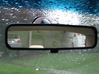
2021 in the Rearview


I don't know about you, but I'm happy to put 2021 in the rearview mirror.  Yet, despite the many challenges that came over the past 12 months, some recurring positive aspects of my work and professional practice continued to poke through the gloom.

Here are some good things I'll be carrying with me and considering some more in 2022.  (Each title link below brings you to a related 2021 ExhibiTricks post.)


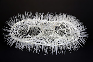
I always enjoy being inspired by and sharing the work of creative folks.  I especially enjoyed the wonderful cable tie sculptures made by Sui Park.


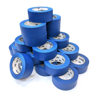
Taking a little time to prototype and test ideas is such an important part of making great exhibits, but so often overlooked or "rationalized" away.  Make a New Year's resolution to use more TAPE!


Some museums have it, and some don't.  What can you do in 2022 to imbue your work, and the places where you work, with authentic museum spirit?


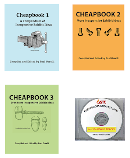
I think one of the major strengths of museum workers is their willingness to share -- their ideas, their time, their hard-won lessons learned. So I was delighted this year to work with ASTC to release all four volumes of the Exhibit Cheapbooks out into the wild for FREE! (Of course, you can always check out the "Free Exhibit Resources" section of the POW! website for articles, videos, and other cool stuff!)


Here's wishing ExhibiTricks readers and subscribers a happy, healthy, and prosperous 2022!


Don't miss out on any ExhibiTricks posts! It's easy to get updates via email or your favorite news reader. Just click the "Sign up for Free ExhibiTricks Blog Updates" link on the upper right side of the blog.

Paul Orselli writes the posts on ExhibiTricks. Paul likes to combine interesting people, ideas, and materials to make exhibits (and entire museums!) with his company POW! (Paul Orselli Workshop, Inc.) Let's work on a project together!

If you enjoy the blog, you can help keep it free to read and free from ads by supporting ExhibiTricks through our PayPal "Tip Jar"
Monday, December 6, 2021

Exhibit Design Inspiration -- Literary Clock


Maker (and manager of the electronics workshop at the Royal Academy for Arts) Jaap Meijers released this Instructable that shows how to repurpose an old e-reader into a very special type of clock -- a Literary Clock!

What is a "Literary Clock" you might ask?  It's a device that tells the time by quoting "timely" passages from literary works.  The "literary time" updates every minute, so for instance at 9:23 in the evening, it will read:

My father met me at the station, the dog jumped up to meet me, missed, and nearly fell in front of the 9:23 pm Birmingham express.

This is an incredibly inventive concept, and I kinda want to see one in every library.  If you don't have an old e-reader handy, you can still use this Web-based version called "Literature Clock" that was developed by Johannes Enevoldsen, inspired by Jaap Meijers' original idea.


Don't miss out on any ExhibiTricks posts! It's easy to get updates via email or your favorite news reader. Just click the "Sign up for Free ExhibiTricks Blog Updates" link on the upper right side of the blog.

Paul Orselli writes the posts on ExhibiTricks. Paul likes to combine interesting people, ideas, and materials to make exhibits (and entire museums!) with his company POW! (Paul Orselli Workshop, Inc.) Let's work on a project together!

If you enjoy the blog, you can help keep it free to read and free from ads by supporting ExhibiTricks through our PayPal "Tip Jar"
Monday, November 22, 2021

Giving Thanks (in Museums)


This is the time of the year in the U.S. that we celebrate Thanksgiving, a holiday meant to remind us of all the people and things in our lives that we have to be thankful for.  Despite the turmoil in the world, I do feel very thankful for my family, my work, and the friends I share my life with.

I'm also very thankful for ExhibiTricks Readers and Subscribers!  I really appreciate the thousands of you who read this blog each and every week.  If you ever have ideas or suggestions for ExhibiTricks, feel free to email me.

And now, without further ado, here is one of my favorite posts about ways of thanking our donors, community supporters, and stakeholders:

Many Ways To Say Thanks

Most donor recognition installations in museums are really ways to say thanks.  And who could argue with that?

But you can thank someone with the equivalent of a cheap mass-produced card you grabbed on your way home, or with the donor recognition version of a homemade loaf of bread accompanied by a carefully chosen book inscribed to the recipient.

In the past, I've asked museum folks for images of interesting and thoughtful examples of donor recognition.  I received an avalanche of images --- many more than I'll include in this post, so I've gathered all the images that I've received into a free PDF available for download from the POW! website.

Just click on the "Free Exhibit Resources" link near the center-top of any page on the website, and you'll see an entire collection of free goodies, including the newly added link called "Donor Recognition Examples."  Once you click on the link you'll get the PDF of images. (Be patient --- it's a BIG file.)

So what sorts of images and examples of donor recognition did I receive?  They fell into several larger categories, namely:

• Frames and Plaques

• Walls and Floors

• Genre Specific

• Mechanical/Interactive

• Interesting Materials

• Digital Donor Devices

So let's take each of the six categories and show a few examples of each.


FRAMES and PLAQUES

I'm sure you've seen lots of bad examples of this donor recognition approach, but there is a lot to be said for the simplicity (and creative twists!) that can be employed using this technique.

The image at the top of this post is a nice example of "helping hands" (but still essentially plaques) in this category from the Chicago Children's Museum.

I like the use of colors and the physical arrangements in the following two examples. The first pair of images comes from the Children's Museum of Pittsburgh (with bonus colored shadows!)


The next is a sert of back-lit elements designed by Skolnick A+D Partnership for the Children's Museum of Virginia --- The entire unit is essentially one big lightbox!


Light is also used as a strong element in the image below from Macalester College.  The folks from Blasted Art used Rosco's Lite Pad product to create the glowing text.


Lastly, I like this simple example from the MonDak Heritage Center.  Just frames, but it does the job nicely.


WALLS and FLOORS

Sometimes donor recognition wants to be BIG, in an architectural sense, so interior or exterior walls are used  --- and sometimes even floors!

Here are two exterior wall examples that stood out.  The first from the Creative Discovery Museum

And the second from the Oakland Museum.  They are both colorful and animate nicely what would otherwise be a big blank wall.


 Here's a nice interior wall from Discovery Gateway, in Salt Lake City


Each of the pieces is back-laminated graphics on acrylic.  (Here's a detail.)


Of course, even the best-laid donor recognition plans can get circumvented by operational issues!


And lastly, here's a floor example from The National Museum of Nuclear Science and History.  It's the Periodic Table with donors in each element.


GENRE SPECIFIC

Several people sent examples of genre specific donor recognition designs.  A popular motif is to use collection objects or images, especially in the case of Natural History Museums.

Here is the Specimen Wall from the California Academy of Sciences.  It's an elegant  low-tech solution that features specimen reproductions encased in laminated glass. The wall was conceived by Kit Hinrichs and realized in collaboration with Kate Keating Associates, with fabrication by Martinelli Environmental Graphics and glass by Ostrom Glassworks.


Here's a clever use of old school tabletop jukeboxes to recognize donors to radio station WXPN put together by Metcalfe Architecture & Design in Philadelphia.


MECHANICAL / INTERACTIVE

In the same way that interactive exhibits are fun and memorable, donor recognition can be too!

Gears are a popular motif in this regard.  The first image (Grateful Gears) is from an installation at the Kentucky Science Center, while the second is from the Madison Children's Museum.


INTERESTING MATERIALS

Sometimes the design element that gets people to stop and actually read the donor names are the unusual materials that the donor recognition piece is made of. If the materials relate to the institution itself, so much the better!


This first image comes from the San Francisco Food Bank


The next is from the Museum Center at 5ive Points, in Cleveland Tennessee which has a strong history of copper mining.  So this intricate donor recognition piece is made from copper!


I love this clever use of miniature doors and windows at the Kohl Children's Museum.  You can open doors and windows to reveal additional information about donors.


The last entry from this section is the truly striking three-dimensional "Donor Tree" from the Eureka Children's Museum in the UK.


DIGITAL DONOR DEVICES

As with all museum installations, digital technology plays an increasing role --- even in Donor Devices.

One unit that stood out was this digital donor recognition device at the National  Historic Trails Center that solicits donations in real-time and puts up digital "rocks" on the rock wall screen of different sizes --- depending on the size of your donation, of course!  A really neat idea that beats a dusty old donation box,  hands down.


As I mentioned earlier, these images are really the tip of the iceberg.  So please check out the entire PDF of all the images I received by heading over to the "Free Exhibit Resources" section of my website.

Also, if you have some other really good examples of donor recognition installations or devices, feel free to contact me and email them along, and I can share them in future ExhibiTricks posts.


Don't miss out on any ExhibiTricks posts! It's easy to get updates via email or your favorite news reader. Just click the "Sign up for Free ExhibiTricks Blog Updates" link on the upper right side of the blog.

Paul Orselli writes the posts on ExhibiTricks. Paul likes to combine interesting people, ideas, and materials to make exhibits (and entire museums!) with his company POW! (Paul Orselli Workshop, Inc.) Let's work on a project together!

If you enjoy the blog, you can help keep it free to read and free from ads by supporting ExhibiTricks through our PayPal "Tip Jar"
Saturday, November 13, 2021

Design Inspiration: Anonymouse


Anonymouse is an anonymous Swedish artist collective that builds mouse-themed miniature buildings and displays them in public.


Anonymouse posts pictures of their work on Instagram, like the ones featured in this post.


I especially liked "Ricotta Records" and all the miniature mouse-themed record albums and posters inside.

Ricotta Records exterior


"Amy Winemouse" record album from Ricotta Records


How can we inject more fun surprises like these mouse houses inside and outside our museums?


Don't miss out on any ExhibiTricks posts! It's easy to get updates via email or your favorite news reader. Just click the "Sign up for Free ExhibiTricks Blog Updates" link on the upper right side of the blog.

Paul Orselli writes the posts on ExhibiTricks. Paul likes to combine interesting people, ideas, and materials to make exhibits (and entire museums!) with his company POW! (Paul Orselli Workshop, Inc.) Let's work on a project together!

If you enjoy the blog, you can help keep it free to read and free from ads by supporting ExhibiTricks through our PayPal "Tip Jar"

Wednesday, November 3, 2021

Website Window: Street Art Utopia


One of my favorite things to do when visiting a new city is to wander around and find street art.


Enter the Vortex in Paris


My definition of street art is a fairly broad one, encompassing graffiti, murals, and site-specific installations.


By Damon Belanger in Redwood City, California, USA.


Alas, the COVID Pandemic has put a severe crimp into both traveling and wandering ...


“Olivia mira el cielo” by Martín Ron


So I was delighted to come upon the Street Art Utopia website which "declares the world as their canvas."


Black Fox – In Riga, Latvia


I've highlighted a few recent examples in this post, but click on over to the Street Art Utopia website yourself to see lots more!


Bull sculpture by Dong Hyun Kang


Don't miss out on any ExhibiTricks posts! It's easy to get updates via email or your favorite news reader. Just click the "Sign up for Free ExhibiTricks Blog Updates" link on the upper right side of the blog.

Paul Orselli writes the posts on ExhibiTricks. Paul likes to combine interesting people, ideas, and materials to make exhibits (and entire museums!) with his company POW! (Paul Orselli Workshop, Inc.) Let's work on a project together!

If you enjoy the blog, you can help keep it free to read and free from ads by supporting ExhibiTricks through our PayPal "Tip Jar"
Wednesday, October 20, 2021

Make Some Paper and Tape Prototypes!

Earlier this month I was delighted to present an exhibit prototyping workshop at the Museums Alaska conference.

Thomas Edison said,  "To invent, you need a good imagination and a pile of junk."  His reference was to inventing, but he could have also been speaking about prototyping.

To me, prototyping is an iterative process that uses simple materials to help you answer questions about the physical aspects of your exhibit components (even labels!) early on in the development process.  

Maybe it's just me, but I can't imagine anyone fabricating an exhibit component without trying out a quick-and-dirty version first.  So in today's post, I thought I'd lay out the simple steps I use to show how quickly and inexpensively prototyping can be integrated into the beginning of any exhibit development process, and how you too can become an Office Supplies Prototyping Superstar!


STEP ONE:  Figure out what you want to find out.

In this case, a client wanted me to come up with an interactive version of a "Food Web" (the complex interrelationship of organisms in a particular environment, showing, basically, what eats what.)  We brainstormed a number of approaches (magnet board, touch screen computer) but finally settled on the notion of allowing visitors to construct a "Food Web Mobile" with the elements being the various organisms found (in this particular case) in a mangrove swamp.  The client was also able to provide me with a flow chart showing the relationships between organisms and a floor plan of the area where the final exhibit will be installed.

The two initial things I wanted to test or find out about from my prototype were:

1) Did people "get" the idea conceptually?  That is, did they understand the relationships and analogies between the Food Web Mobile and the actual organisms in the swamp?

2) Could they easily create different sorts of physical arrangements with the mobile that were interesting and accurate?


STEP TWO: Get out your junk!


As in the Edison quote above, it helps to have a good supply of "bits and bobs" around to prototype with.  You might not have the same sorts of junk that I've gathered up over years in the museum exhibit racket, but everyone should have access to basic office supplies (stuff like paper, tape, markers, index cards, scissors, etc.)  And really that's all you need to start assembling prototypes. (The imagination part is important, too.)


STEP THREE: Start playing around with the pieces ...


Before I even start assembling a complete rough mechanism or system I like to gather all the parts together and see if I like how they work with each other.  In the case of the Food Web Mobile prototype, I used colored file folders to represent different levels of organisms.  I initially made each color/level out of the same size pieces, but then I changed to having each color be a different size.  Finally, I used a hole punch to make the holes and bent paper clips to serve as the hooks that would allow users to connect the pieces/organisms in different ways.


STEP FOUR:  Assemble, then iterate, iterate, iterate!

 
This is the part of the prototyping process that requires other people besides yourself.  Let your kids, your co-workers, your significant other, whoever (as long as it's somebody besides yourself) try out your idea. Obviously, the closer your "testers" are to the expected demographic inside the museum, the better --- ideally I like to prototype somewhere inside the museum itself. 

Resist the urge to explain or over-explain your prototype.  Just watch what people do (or don't do!) with the exhibit component(s).  Take lots of notes/pictures/videos.  Then take a break to change your prototype based on what you've observed and heard, and try it out again.  That's called iteration.


In this case, I saw right away that the mobile spun and balanced in interesting ways, but that meant that the labels would need to be printed on both sides of the pieces.  Fortunately, three young "testers" (ages 6, 11, and 13) seemed to "get" the concept of "Food Webs" embedded into the Mobile interactive, and started coming up with interesting physical variations on their own.


For example, I initially imagined people would just try to create "balanced" arrangements of pieces on the Mobile.  But, as you can see below, the prototype testers enjoyed making "unbalanced" arrangements as well (which is fine, and makes sense conceptually as well.)   Also, we discovered that people realized that they could hang more than one "organism piece" on the lower hooks (which was also fine, and also made sense conceptually.)


STEP FIVE: Figure out what's next ... even if it's the trash can!

Do you need to change the label or some physical arrangement of your prototype?  Using simple, inexpensive materials makes that easy.

Do you just need to throw out this prototype idea?  Using simple, inexpensive materials makes it easier to move on to a new idea, too. (Much more easily than if you had spent weeks crafting and assembling something out of expensive materials from your workshop...)  It's not too surprising to see people really struggle to let a bad exhibit idea go, especially if they've spent several weeks putting it together. Quick and cheap should be your watchwords early on in the prototyping process.

In this case, I sent photos of the paper clip prototype and a short video showing people using the Food Web Mobile to the client as a "proof of concept."  They were quite pleased, and so now I will make a second-level prototype using materials more like those I expect to use in the "final" exhibit (which I'll update in a future post.)  Even so, I will still repeat the steps above of gathering materials, assembling pieces, and iterating through different versions with visitors. 

I hope you'll give this "office supplies" version of exhibit prototyping a try for your next project!

If you'd like me to give a prototyping workshop at your museum, contact me and check out the "Workshops" section of the POW! website to see examples of other workshops I've done for museum groups all over the world!


Don't miss out on any ExhibiTricks posts! It's easy to get updates via email or your favorite news reader. Just click the "Sign up for Free ExhibiTricks Blog Updates" link on the upper right side of the blog.

Paul Orselli writes the posts on ExhibiTricks. Paul likes to combine interesting people, ideas, and materials to make exhibits (and entire museums!) with his company POW! (Paul Orselli Workshop, Inc.) Let's work on a project together!

If you enjoy the blog, you can help keep it free to read and free from ads by supporting ExhibiTricks through our PayPal "Tip Jar"

Wednesday, October 6, 2021

Taking on Unpaid Internships with Sweatober!


The National Emerging Museum Professionals Network (NEMPN) is taking aim at unpaid internships, seeking to end the practice in museums, libraries, and archives. The Network launched its inaugural "Sweatober" campaign to fund previously unpaid internships in museums and to encourage individuals to “sweat to pay interns.”

A dual-purpose campaign, Sweatober operates like a walk-a-thon, encouraging participants to “get moving” and to raise funds while they do it. Participants can register as teams or individuals, and donors can offer support by the number of exercise minutes recorded or with a flat monetary donation. Participants commit to a minimum of 200 minutes and to raise $200. The campaign also features branded gear, and all proceeds support the program.

“We launched Sweatober to bring attention to unpaid internships and the detriment they cause to young professionals’ early careers and their long-term earning and career potential,” said Sierra Van Ryck de Groot, co-President of the NEMPN Board of Directors. “NEMPN hears from far too many young professionals who enter the museum field only to find that they can’t afford the career that they’ve chosen, and then they have to give up their passion. Unpaid internships, which presently make up most of the opportunities in the field, play a significant role in this.”

As of August 2021, more than 40-percent of internships across all industries in the United States remain unpaid, and students with unpaid internships on their resumes can expect to earn far less at full-time jobs than those with paid internships.

According to Van Ryck de Groot, part of the problem is that internships are often required for incoming museum professionals to get an interview for a full-time position. “In museums, we consistently see entry-level positions with base entry-level pay requiring two to three years of relevant work experience on top of a degree,” she said. “This means that those coming into the field out of college must secure an internship for three out of four years of their college experience, and paid internships are rare.”

Unpaid internships create troubling trends in pay inequity for paid professionals. In the museum industry, incoming professionals with a four-year degree can expect to earn less than $40,000 per year on average across all U.S. cities, and those with unpaid internships don’t have the connections, experience, or salary history to leverage towards a job. The National Association of Colleges and Employers (NACE) found in 2016 that the non-profit job offer rate for graduates with paid internships on their resumes was 51.7-percent versus 41.5-percent for those with unpaid internships. Compounding the problem, the study found that entry-level non-profit professionals who completed unpaid internships were offered up to $10,500 less than those who had secured paid internships.

“Young professionals who take on unpaid internships start their careers on unequal footing,” said Sierra Polisar, co-President of the NEMPN Board of Directors. “They’re conditioned to believe that experience and the mission are more important than being able to pay your bills, and often, they’re paying tuition for internship credits in addition to not getting paid. On top of that, they are often missing out on the types of learning and networking experiences that come with paid internships, where organizations are more invested in the outcome. All of these things make it difficult to get an interview, get an offer, and negotiate for your present and your future.”

In addition to Sweatober, NEMPN will soon launch its signature Dreamweavers program to give internship coordinators the tools to transform their unpaid internship programs into paid learning experiences. “The goal of Dreamweavers is to put an end to unpaid internships and also to transform internships that don’t teach actionable skills into opportunities for interns to learn from people who are invested in their long-term success,” said Polisar. Dreamweavers launches in early 2022.

To join the Sweatober campaign against unpaid internships, register a team or donate at the Pledgeit Sweatober Campaign Headquarters.

To grab your Sweatober gear, visit the NEMPN Sweatober Store.


Don't miss out on any ExhibiTricks posts! It's easy to get updates via email or your favorite news reader. Just click the "Sign up for Free ExhibiTricks Blog Updates" link on the upper right side of the blog.

Paul Orselli writes the posts on ExhibiTricks. Paul likes to combine interesting people, ideas, and materials to make exhibits (and entire museums!) with his company POW! (Paul Orselli Workshop, Inc.) Let's work on a project together!

If you enjoy the blog, you can help keep it free to read and free from ads by supporting ExhibiTricks through our PayPal "Tip Jar"

Thursday, September 30, 2021

Museum People Resources Alert: Hook Your Audience


Dr. Paul McCrory
runs HOOK Training Ltd, a company devoted to helping educators engage their learners. His approach combines interactive performance techniques and psychology. He has spent over 20 years working as an informal science educator and trainer in the UK, Ireland, and internationally. The most interesting thing about Paul is that he has a Ph.D. in being interesting.

Paul has recently released an essential resource for anyone in museums who interacts with the public -- a book called "Hook Your Audience."  

Hook Your Audience is a toolkit of performance techniques to emotionally engage child and family audiences in interactive, educational presentations. Its main purpose is to encourage you to reflect more deeply on exactly how you hook your learners using a variety of engagement techniques. Many of these hooks are borrowed from other professional performers, such as magicians, stand-ups, street performers, and actors.

I found some great tips inside Hook Your Audience, and I'm sure you will, too!  

In light of the impact of Covid-19 on the informal education sector, Paul has generously made the full text of the book available online until the end of October 2021. 

Paul was also kind enough to respond to a few questions about his work and his new book for ExhibiTricks readers.  Enjoy!


What got you interested in being a science presenter?

As a child, I was obsessed with two things — science and magic. Performing magic shows allowed me — for a limited time — to overcome my natural shyness and introversion. As an adult, I discovered that I could combine elements of both of these passions to perform science demo shows which provoked emotions in my audience. I'm still shy and introverted, but for the duration of a show, I'm able to exaggerate other parts of my personality to engage the audience ... on a good day :-)  I love being able to trigger other people to experience some of the wonderful emotions I have when I encounter the scientific phenomena which surround us.
 
A pivotal moment in this journey was studying for an MSc in Communicating science at Techniquest science centre in Cardiff, Wales. This is when I stumbled upon what I wanted to do as a career — exploring ways of getting people curious about science by demonstrating how it affects so much of our lives. Latterly, this has morphed into a deeper quest searching for the psychological interest hooks that make some things universally interesting to almost everybody. I've become obsessed with trying to collect and categorise these hooks.


Tell us a little bit more about your Hook Your Audience book.

When I was studying for my MSc, I became frustrated at not being able to find books that explained how to engage audiences as a professional science presenter. It seemed you had to learn everything through peer wisdom and training in your organisation, from watching other presenters or by discovering it yourself through performing. All of these sources are important and necessary, but having to rely solely on them — rather than leveraging books to give you a head start — struck me as extremely inefficient and slow.

So in a short appendix to a module assignment on presentation skills, I started a life-long habit of reflecting on my performances and capturing the techniques I was using or observing in other presentations. Over 21 years (including a Ph.D. on how educators can create interest through their performance), a 20-page appendix grew into a 90k word book. 

Hook Your Audience (Volume 1) is a toolkit of performance techniques to emotionally engage child and family audiences in interactive, educational presentations. It's aimed at career informal educators working in visitor attractions or outreach organisations. One of the central ideas behind the book is that, in informal education, nobody has to listen to you. So without being able to win and keep the attention of your audience, all of your other objectives are impossible to achieve. The question is — how do you do this? Spoiler alert - engage their emotions and interact with them. 

There. That'll save you reading the whole book :-)  

Sometimes people ask me about the "Volume 1" in the title. This book covers the first half of the delivery toolkit (character; liveness; expressing emotions; all-audience interaction; volunteers; questions; humour) and, somewhat predictably, volume 2 should address the other delivery tools (e.g. creating focus through your voice and body; suspense and surprise; telling stories; explaining; images, props and demos; and managing audience behaviour).


What are some of your favorite resources for people interested in finding out about how to give interactive science presentations?
 
I spend much of my life being a liminal — I lurk on the edges of many different fields and look for ideas that transfer well into the worlds of education and presenting. There's lots we can learn from other fields where attention is fiercely competitive, e.g. performing artists (such as magicians, stand-ups, actors, street performers, improvisers, children's entertainers); advertisers and copywriters; journalists; filmmakers and screenwriters; playwrights and theatre directors; computer game and app designers; fiction writers; viral video stars. All of these people live, or die, by how well they can sustain the attention of their voluntary audiences. Many of the principles and techniques in Hook Your Audience have been borrowed from other professional performing arts.

Three books from completely different genres that I would recommend to any science presenter to help them reflect on how they engage their audiences are:

●  Maximum Entertainment 2.0, by Ken Weber — one of my favourite books about performing skills for magicians. It gives a glimpse into the incredible deliberation and attention to detail professional performers invest in every part of their act.

●  Made to Stick: Why Some Ideas Survive and Others Die, by Chip and Dan Heath — brilliantly decontructs what makes ideas sticky in our minds. Should be required reading for every formal or informal educator. You can get a flavour of the strategies they cover from this free resource, framed for teachers - https://heathbrothers.com/download/mts-teaching-that-sticks.pdf

●  Khrushchev's shoe: And Other Ways To Captivate An Audience Of One To One Thousand, by Roy Underhill — this undiscovered gem of a book contains a wealth of wisdom about keeping the attention of your audience. Its author has had an eclectic career in theatre, demonstrating at an outdoor museum and hosting one of the longest-running educational programmes on American television, but he is a master teacher at heart.


What do you think is the “next frontier” for science presenters?
 
If the last 18 months have taught us anything, it's the danger of making confident predictions about what will happen in this world so shaped by humans, for both good and ill. However, I'll try and answer this question by using three perspectives that I believe will each affect how the medium of the science demo show evolves - there are so many exciting possibilities that lie ahead.

a) Science Show Issues
Science presenters are already starting to address some of these issues, but we are still at the beginning of this process, e.g. 
●  widening the range of subjects explored in science shows beyond the physical sciences; 
●  investigating how shows can be used to discuss ethical questions and to motivate long-term attitude and behaviour change;         
●  exploiting the power of story to create more engaging and memorable shows;
●  more clearly revealing how science works (a key factor in building the public's trust in science); 
●  incorporating robust findings from science communication, education, and psychological research into how we devise and deliver shows, where they exist;              
●  using the latest AV technology to bring scientific ideas to life on the stage (e.g. augmented reality)  and to better interact with the audience (e.g. using audience polling, and even physiological measurement of their emotional states, to shape the direction of a live show);
●  finding meaningful ways to evaluate the impact of one-off shows, but doing so in a way that doesn't damage the precious experience we trying to create.                     

b) Societal Trends 
Science shows thankfully aren't written in a vacuum. They are informed by concerns and changes in society. These trends include — striving to make our shows more inclusive and diverse in order to connect with more people; considering how to better support presenters who are experiencing mental health difficulties because of the pressures of the constant need to emote on demand for their job; and developing engaging virtual show formats that are likely to remain an option in our future hybrid world. 

c) The P Word  
There is an elephant in the room affecting the science show sector — the fundamental need to professionalise everything we do as science presenters. We need to be much more intentional about every aspect of how we write, rehearse and deliver science shows. We need to create the frameworks that exist in other professions — a range of resources to support the development of presenters over their career; a structure that allows for career progression in the organisations in which presenters work; and, if not agreed standards, at least begin a discussion about what constitutes an effective science show for particular objectives.


If money were no object, what would your “dream” project be?

My dream project? Imagine if the Blue Man Group devised a spectacular science demo stage show.  A performance that moved the audience to experience the full gamut of emotions invoked by awesome demonstrations of the power and the mysteries of science.

Now I'm not saying that every science show should have these goals and production values, but I'm convinced there's room for science demo shows in the harsh commercial arenas of the West End or Broadway. Part of the motivation for this dream is the romantic in me harking back to the early days of theatrical science demonstrations when "wonder shows" were all the rage. In the eighteenth and nineteenth centuries, the public queued up to witness dramatic stage demos revealing the latest scientific breakthroughs. One of the saddest aspects of modern life for me is that so many of us seem to have lost the capacity to feel wonder.


Thanks again to Dr. Paul McCrory for sharing his thoughts with ExhibiTricks readers -- make sure to check out Hook Your Audience by clicking over to Paul's website!


Don't miss out on any ExhibiTricks posts! It's easy to get updates via email or your favorite news reader. Just click the "Sign up for Free ExhibiTricks Blog Updates" link on the upper right side of the blog.

Paul Orselli writes the posts on ExhibiTricks. Paul likes to combine interesting people, ideas, and materials to make exhibits (and entire museums!) with his company POW! (Paul Orselli Workshop, Inc.) Let's work on a project together!

If you enjoy the blog, you can help keep it free to read and free from ads by supporting ExhibiTricks through our PayPal "Tip Jar"

Wednesday, September 22, 2021

Talking Across a Gap -- A Guest Post from Gillian Thomas


After a career leading museum projects in the UK and US, with early experience in France, and advising in a wide range of countries across the world, Gillian Thomas is now an international consultant on cultural projects for trusts, foundations, and governments. She enjoys helping people identify what they really want to do and then overcoming any obstacles to doing it – from vision to reality.

Gillian has kindly shared her timely essay below with ExhibiTricks readers. Enjoy!


Talking Across a Gap

We talk a lot about people having a voice, not having a voice, not having a seat at the table – but the question is more about who is listening and is this reciprocal? All too often we are putting out opinions, asking for feedback but maybe not really wanting it and rarely really wanting to change what we think or do as a result. This does tend to make feedback more angry and loud, in an attempt to really be heard. 
Whether we are talking about age gaps or about different societal groups, especially if feeling unheard, unappreciated, we are much more prone to shout our position than to hear and think about the position of others. Perhaps we need to relearn how to talk to one another which means listening and trying to understand.

This summer has been a time for change as COVID restrictions were lifted somewhat yet still impact everything we do. An influx of visitors, after not having seen anyone for a while, made me value the conversation and also realize this requires an effort. Age range was one aspect of our guests, from 10 to 85, with some limited diversity. Food is another: while sharing a meal, it is much more difficult to have a full-blown argument with shouting and much easier to listen to something you don’t agree with if you have something delicious to chew. With several people around a table, you also have time to think, listen to more than one viewpoint. Ah, you may say, that’s because you weren’t the one doing the cooking – but I was. However, this gave me an added pleasure of seeing people enjoying the food and also the chance to walk away for a moment, if I needed a breather. 
 
Learning how to talk without offending each other yet being able to express one’s views, as opposed to just keeping quiet, can be a challenge. This is, I think, a skill we could learn – but it requires patience on both sides. I’ve got it wrong lots of times, saying something, making assumptions – some I realized and some probably not, so I would like to be better able to understand those I don’t currently either understand or agree with. Why? Our society needs solidarity, we need to work together for the common good and to get the commitment necessary to solve the major challenges we face. If we waste energy shouting at each other, we don’t make progress. 

So conversations across the gaps need to be encouraged and here are a few guidelines for a starter:

•  Get a mixture, not just one person that is different in some way
•  Small group, 6-10, around a table with food
•  No topic is needed, these emerge, but if stuck, what the future offers gets most people going
•  Accept this doesn’t have to go anywhere, it’s just a chance to get to understand others better and to sometimes challenge’s one’s own positions and attitudes.


This may seem like a very anodyne way forward – but I’ve learned a lot, and enjoyed it. 

Food always helps and if someone gets very argumentative, you can always ask them to help you in the kitchen.


Thanks, Gillian, for sharing some excellent food for thought!  


Don't miss out on any ExhibiTricks posts! It's easy to get updates via email or your favorite news reader. Just click the "Sign up for Free ExhibiTricks Blog Updates" link on the upper right side of the blog.

Paul Orselli writes the posts on ExhibiTricks. Paul likes to combine interesting people, ideas, and materials to make exhibits (and entire museums!) with his company POW! (Paul Orselli Workshop, Inc.) Let's work on a project together!

If you enjoy the blog, you can help keep it free to read and free from ads by supporting ExhibiTricks through our PayPal "Tip Jar"