Tuesday, March 28, 2023

FUN and можело


I've just finished up a fantastic week of workshops with museum folks and independent cultural professionals from Bulgaria.  This first iteration of the "MUSA Academy" was sponsored by the America for Bulgaria Foundation (ABF) and I was joined by my brilliant teaching partners, Jamie Lawyer, and Christina Ferwerda.

Although I'm still processing all the wonderful things that happened and all the cool ideas that popped up this week, two things stand out right now -- the very American idea of FUN and the Bulgarian concept of можело (pronounced mozh-eh-low.)

можело is built on the notion of "we can do this" or "this is possible" but I also think about the word as a way of focusing on "starting somewhere" rather than just completely giving up due to challenges involving money and time, or institutional support.

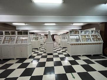
An interesting example of an "old school" museum that has incorporated both fun and можело is the National Museum of Natural History located in the capital city of Sofia, Bulgaria -- specifically the exhibition gallery containing insect specimen cases.

As you can see from the photo below, the left side of the gallery is dominated by row after row of glass-fronted cabinets containing thousands of mounted insect specimens arranged in taxonomic groups. It feels both overwhelming and daunting.


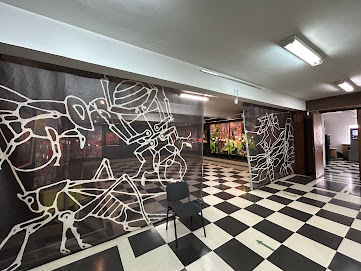
However, if you turn to the right, a different vista beckons you through a set of insect-themed graphical curtains.


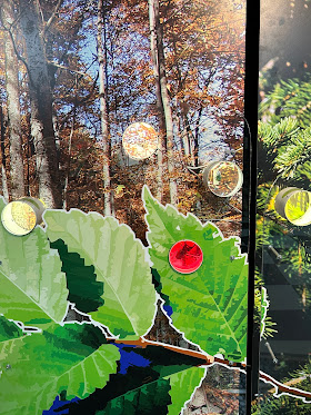
Inside this space is a fun gallery that puts insects found around Bulgaria in context by using large, colorful graphics representing different insect habitats. 


Throughout the space, you can also take closeup looks at representative insect specimens displayed in acrylic tubes.


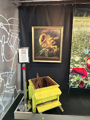
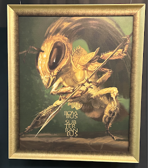
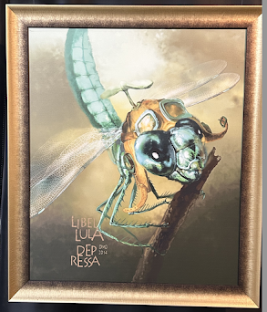
Anchoring each section is a fanciful portrait of another representative insect species (including its scientific name!) like the dragonfly painting at the top of this post or the honeybee below.


While I wish the entire insect gallery was more like this one area, I realize that shifting a 130-year-old museum is a massive task. However, I give the staff, designers, artists, and fabricators kudos for finding a way to insert a bit of FUN and можело into the National Museum of Natural History.


P.S. to find out even more about FUN in museums, check out this wonderful YouTube interview with Christina Ferwerda and her colleague Helen Divjak!


Don't miss out on any ExhibiTricks posts! It's easy to get updates via email or your favorite news reader. Just click the "Sign up for Free ExhibiTricks Blog Updates" link on the upper right side of the blog.

Paul Orselli writes the posts on ExhibiTricks. Paul likes to combine interesting people, ideas, and materials to make exhibits (and entire museums!) with his company POW! (Paul Orselli Workshop, Inc.) Let's work on a project together!

If you enjoy the blog, you can help keep it free to read and free from ads by supporting ExhibiTricks through our PayPal "Tip Jar"
Tuesday, March 21, 2023

Opposites Attract ... Visitors


Opposites attract in exhibit design.  All sorts of juxtapositions, like big/small and old/new create interest for museum visitors.

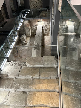
I was reminded of this in every unusual way during a trip to the city of Plovdiv, in Bulgaria.

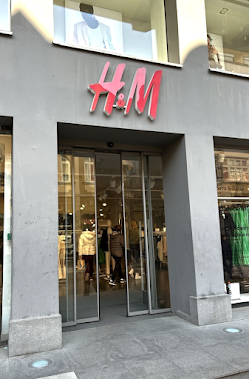
My friends wanted to take me inside a local H&M clothing store to show me a "secret."


Inside was a glass-enclosed remnant of a Roman-era stadium (including some stone seats!) where spectators had watched the chariots race by thousands of years ago!


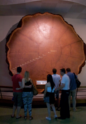
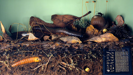
Other examples of "opposites" can be found in the Hall of North American Forests at the American Museum of Natural History in New York City.

The giant Sequoia cross-section pictured at the top of this post, or the amazing "Life on the Forest Floor" diorama, with its cross-section of forest soil (enlarged to 24 times its actual size) are examples of a big/small contrast.

When you start looking for these design "opposites" they start to show up everywhere.  How can you add an "attractive opposite" to your next project?


Don't miss out on any ExhibiTricks posts! It's easy to get updates via email or your favorite news reader. Just click the "Sign up for Free ExhibiTricks Blog Updates" link on the upper right side of the blog.

Paul Orselli writes the posts on ExhibiTricks. Paul likes to combine interesting people, ideas, and materials to make exhibits (and entire museums!) with his company POW! (Paul Orselli Workshop, Inc.) Let's work on a project together!

If you enjoy the blog, you can help keep it free to read and free from ads by supporting ExhibiTricks through our PayPal "Tip Jar"
Sunday, March 12, 2023

Please, WAIT.


If I only could say one thing to someone finishing an installation and about to open a new exhibition or an entire museum building, it would be: 


"Please, resist the urge to make changes and WAIT."


In the emotion-charged weeks leading up to opening day, it is amazing how often well-meaning board members, staff members, or funders will offer all sorts of suggestions for last-minute changes to carefully planned exhibits, graphics, and environments that have often gone through months (or years!) of planning, design, and testing. Most of the time this hand-wringing and teeth-gnashing happens before a new museum or exhibition has even been formally opened for business.

It's human nature, I suppose, to view everything through the hyped-up lens of "perfection," but take a minute, take a breath, and just get ready to observe what actual visitors will do when your project actually opens.

There are two specific instances before opening when you should NOT wait to make changes:

1) When there are clear Safety Factors at play -- exposed electrical elements or sharp corners at little kids' face height, for instance.  If there is an aspect of a new installation or building that raises safety concerns, those things need to be addressed right away.

2) When Functionality is in question. When an exhibit or building element is clearly not working properly -- an exterior door doesn't close, a video monitor doesn't properly display content -- those are also the types of things that clearly can't wait.

But there are many other things that fall outside of Safety and Functionality concerns -- in those "gray area" cases, please do yourself (and your project!) a favor and WAIT until after you see how things really play out once you are open for business.

As a former executive director once told me, "Once the museum's open, it's open forever!"  

You will need time after opening to continue to thoughtfully consider how to change, improve, and evolve what has been set into motion. But that process should be informed by careful observation and consideration, not knee-jerk reactions fueled by pre-opening jitters. 

Please, WAIT.


Don't miss out on any ExhibiTricks posts! It's easy to get updates via email or your favorite news reader. Just click the "Sign up for Free ExhibiTricks Blog Updates" link on the upper right side of the blog.

Paul Orselli writes the posts on ExhibiTricks. Paul likes to combine interesting people, ideas, and materials to make exhibits (and entire museums!) with his company POW! (Paul Orselli Workshop, Inc.) Let's work on a project together!

If you enjoy the blog, you can help keep it free to read and free from ads by supporting ExhibiTricks through our PayPal "Tip Jar"

Wednesday, March 1, 2023

A Better Box?


You always hear museum folks say, "Think outside the box!"

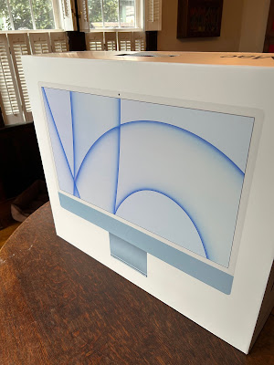
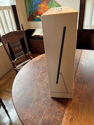
But what if we just need better boxes?  This came to mind recently as I encountered the "better box" that my mother-in-law's new blue iMac computer came in.

Once you opened the exterior brown cardboard shipping box, the white box inside containing the actual computer started us down a delightful little design path.  

First off, as you spun the box around, each section was printed with a photographic view of the iMac inside -- as if you were seeing "through" the box to view the front, back, and sides (see images at the top of this post and below.)  the box practically begged you to open it!


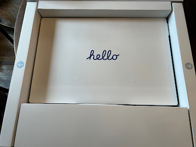
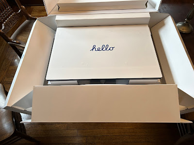
When you flipped open the iMac's box, the very first thing you were greeted with was the word "hello" printed on the removable paper screen cover.  A friendly welcome to the set-up process and a clever throwback to the opening screen message on the very first Macintosh computer.  


Those two arrows on either side orient you and show you what to do next -- to reveal the computer inside like opening the curtains on either side of a stage.


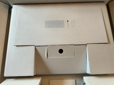
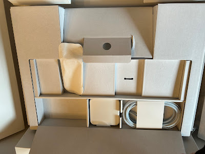
Once you lift the computer out of its cardboard cradle, you see some clear graphic indicators of where your peripherals, like the mouse and keyboard and cables, are located.


But did Apple just throw all the loose peripherals into a cardboard void?  Of course not!  Each component is carefully placed into sections arranged like a Bento box.


Initial delight followed by an orientating welcome capped off by clear, clean graphics showing thoughtful directions and details?  

I think that's just the sort of  "better box" that can frame all sorts of visitor interactions inside museums -- from the lobby entrance sequence to the labels and graphics inside a highly-interactive exhibition space.


Don't miss out on any ExhibiTricks posts! It's easy to get updates via email or your favorite news reader. Just click the "Sign up for Free ExhibiTricks Blog Updates" link on the upper right side of the blog.

Paul Orselli writes the posts on ExhibiTricks. Paul likes to combine interesting people, ideas, and materials to make exhibits (and entire museums!) with his company POW! (Paul Orselli Workshop, Inc.) Let's work on a project together!

If you enjoy the blog, you can help keep it free to read and free from ads by supporting ExhibiTricks through our PayPal "Tip Jar"